Works
Brand's Digital Experience
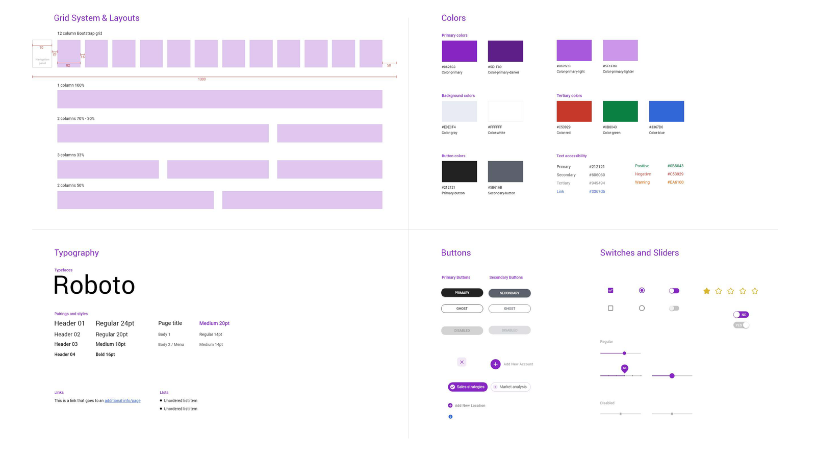
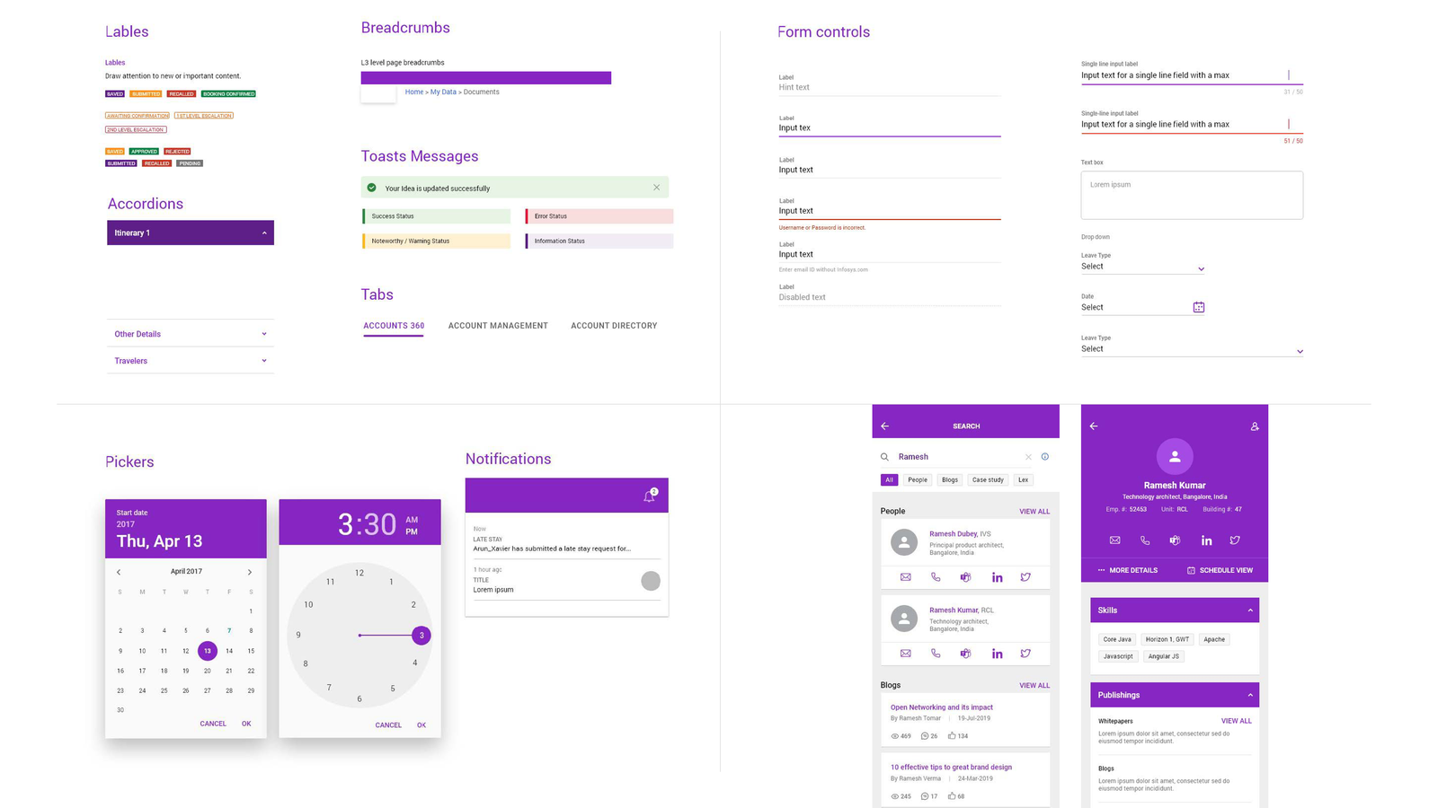
A collection of reusable components

Project Brief
Designing and development with the proper guidelines, having consistency across platform, is a real challenge. Especially when it comes to complex system, working with diverse and huge teams.
Need a scalable, reusable, responsive, with WCAG accessibility system for easy and quick design and development.
Challenges
My Intervention
Understand the challenges that the stakeholders facing in their projects and priorotize the deliveralble as per the need.
Reviewed the current design elements, components, patterns in use and identify what works. Referred Material Design, Carbon, etc. to gather inspiration and understand industry standards.
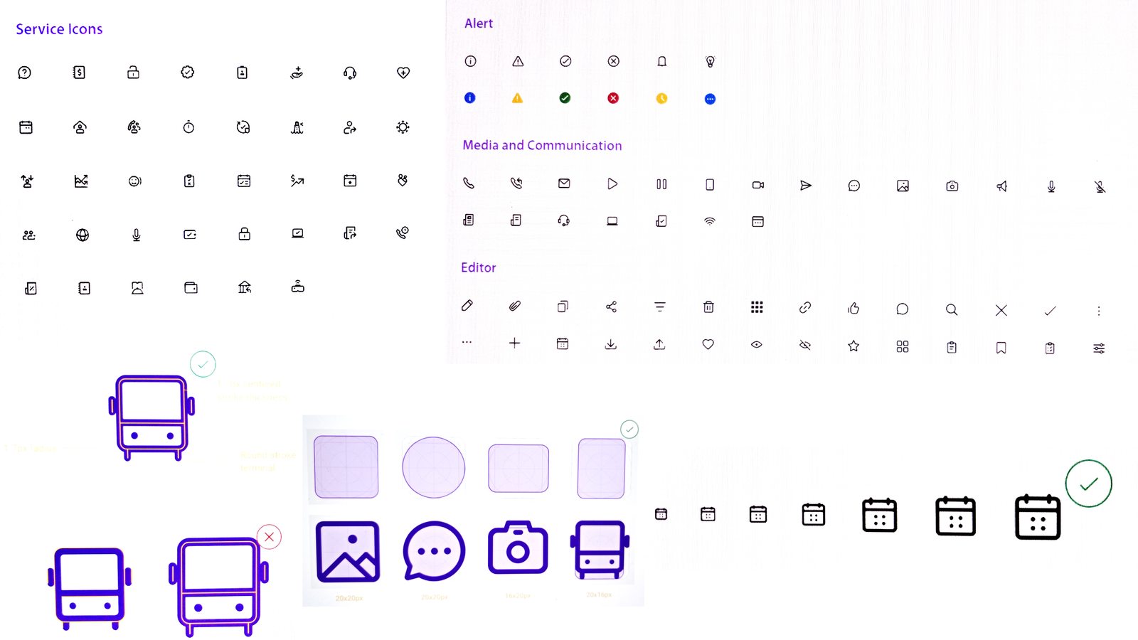
Started designing reusable UI components and set of icons with consistent style, spacing, and behavior across components. Prepared a guidelines on how and when to use each component.
UX Methodology
Define Objectives and Principles:
Component and Pattern Design:
Documentation and Guidelines:
Benefit to Business
A consistent visual style, including colors, typography, and components, helped enhancing brand recognition and user experience across multiple applications.
With pre-built components and guidelines, designers and developers were able to work faster, reducing the time and cost spent on creating and coding new UI elements and it supported teams to collaborate more effectively, as everyone works from the same set of guidelines and resources.


