Works
Tool for Early Modeling (Oncology)
Help, save and improve lives

Project Brief
This is a multi-application economic modeling system designed to ensure that modelers can efficiently and accurately create, modify, and adapt cost-effectiveness and budget impact models for health technology assessment (HTA) submissions around the world.
Challenges
My Intervention
Started from surveys, interviews, and usability testing to gather insights that helped me to take some major design decisions.
Collaborated with cross-functional teams, including developers and product managers throughout the design process to ensures everything is aligned with project objectives, and leads to better outcomes.
Started with a low-fidelity designs, focusing on features, layout, structure, and content organization to visually appealing designs that align with brand guidelines, Design System and design principles.
UX Methodology - (Agile Process)
Research and Analysis:
Design and Testing:
Implementation and Launch:
Benefit to Business
Enhanced UX with design system approach provided business to intuitively interact with the product and with aesthetically appealing UI.
Reduced unnecessary barriers or confusion and boosted the productivity. Automated data to calculate and reduce the user intervention and cognitive load which also reduced training and support cost to the business.
Case Study of Notification System

Problem statement:
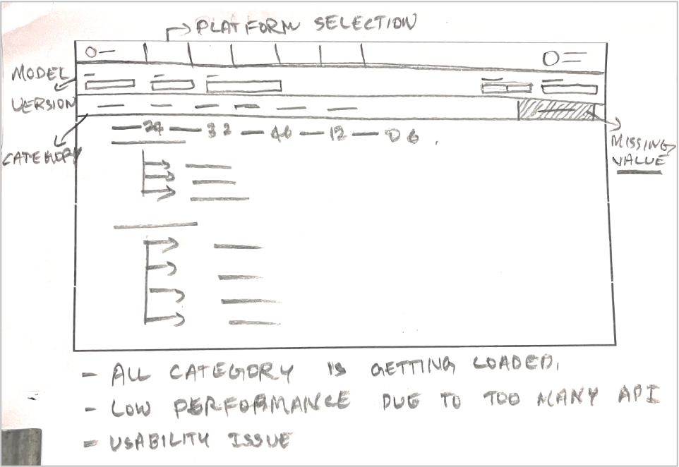
- Data heavy notification that was not so intuitive for users to go through
- User was completely navigating to the new screen just to see the notification
- All the category notification was loading and due to which the performance of it was too low
Business need:
- User should not navigate to new screen, and it should be as an ideal scenario how the notification works
- Better usability to show the data in a structured manner
- Better in performance/speed
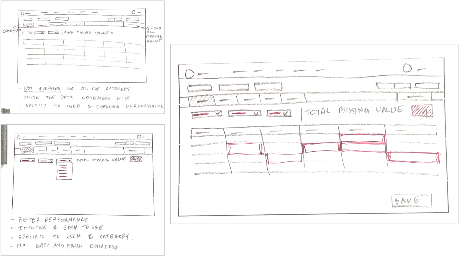
- Not all the category notification is needed for users, except admin and leadership

Proposed options for better usability:
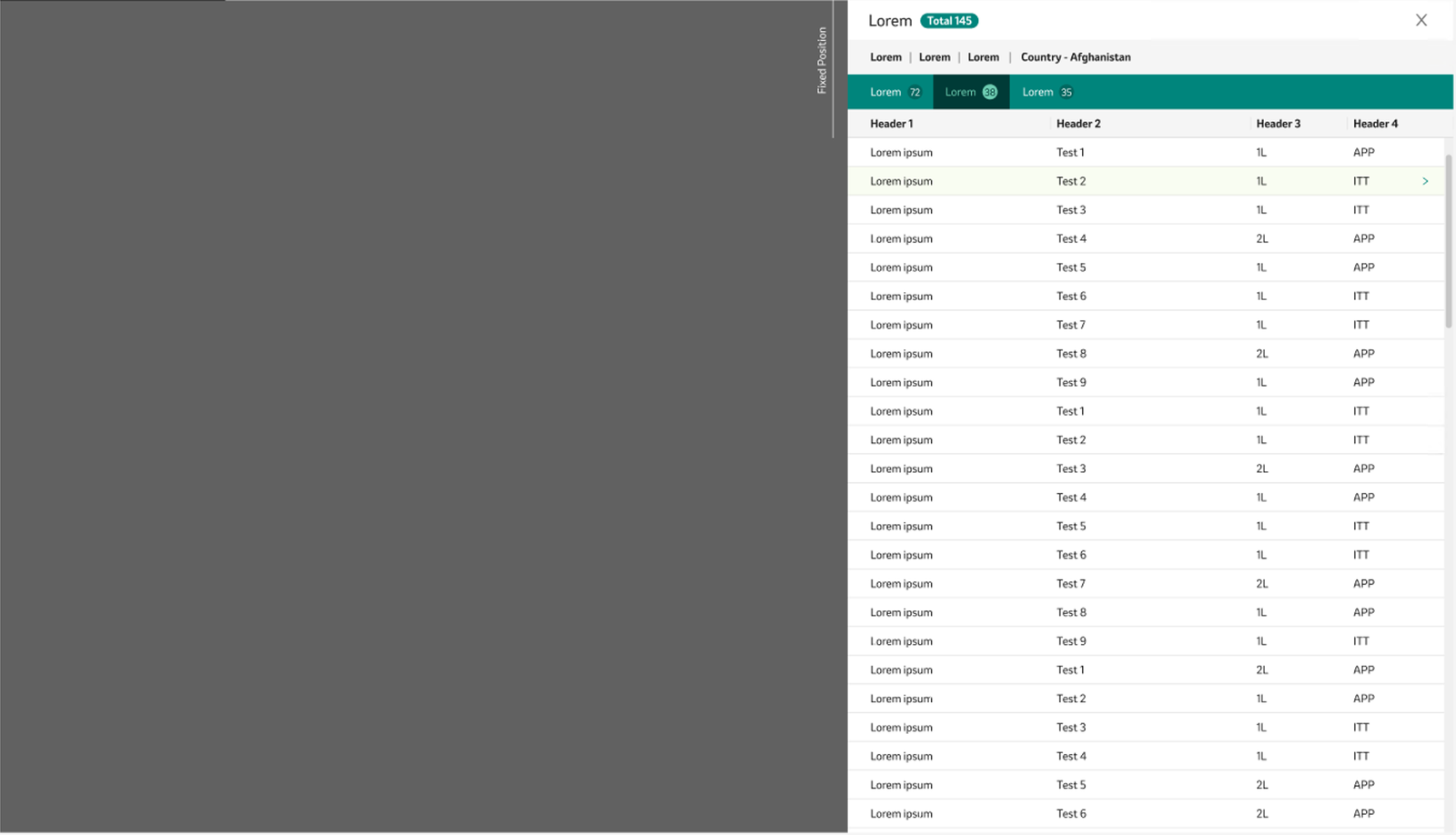
- Option 1: Left slider which overlaps the screen and so user won’t navigate to different screen. It can accommodate minimal category and data.
- Option 2: Bottom slider which overlaps the screen, and It can hold good amount of data as it occupies entire screen

Solutioning:
- Introduced embedded feature so that user can see the notification as a category wise.
- This will improve lot of speed as it wont load all the category data.
- Easily user can identify the missing values and act on it.


